curius
resume.pdf
Back to Home
Design Intern
Fall 2024, 14 weeks
Re-imagining File Management for Filmmakers
Filmmakers are drowning in footage long before they start editing.
I designed a new way for editors to browse, summarize, and organize video, before editing begins.
At Kino AI, I led design efforts like branding, the redesign of Search, and, Timeline: a multi-camera, AI-powered interface that helps editors find meaning amidst terabytes of footage.
Backed by
Movies are humanity’s stories, hopes, & dreams.
One of the hardest truths in post-production is that much of the process isn’t very beautiful: finding clips is painful, slow, and tedious.
At Kino, we asked ourselves: How can we make more parts of the editing process feel lighter, faster, and more human?
[UXR] One assistant reality TV editor told us they spent ~70% of their time just finding footage. That kind of inefficiency isn’t just frustrating — it’s expensive.
Up until the point editors are opening their video-editing apps, there’s a loss of knowledge
Dealing with my own tangled folder structures and chaotic clip names, I took my empathy and stepped into a much larger stage: 100+ cameras, 24/7 logging, and enterprise clients with million-dollar sets.
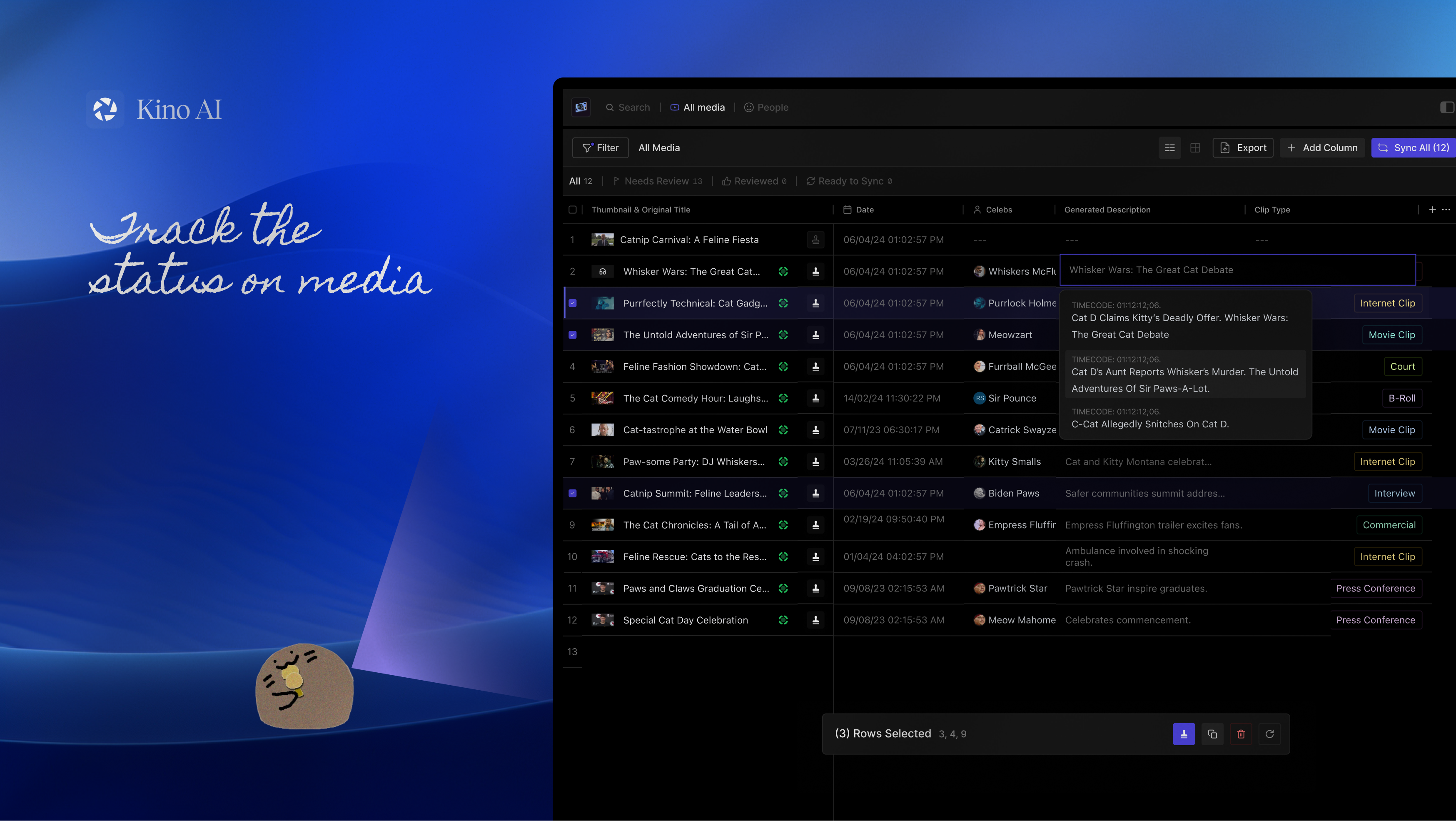
Up until the point editors are opening their video-editing apps, there’s a loss of knowledge-- no easy way to visualize your files. While Kino already offered AI tagging and search, it often surfaced content out of narrative context. Editors were still relying on Post-its, chat logs, and personal spreadsheets to keep track of important moments.
In the best software that money can buy, footage was searchable, but still contextless.
pain
my files system for a 5 min documentary!
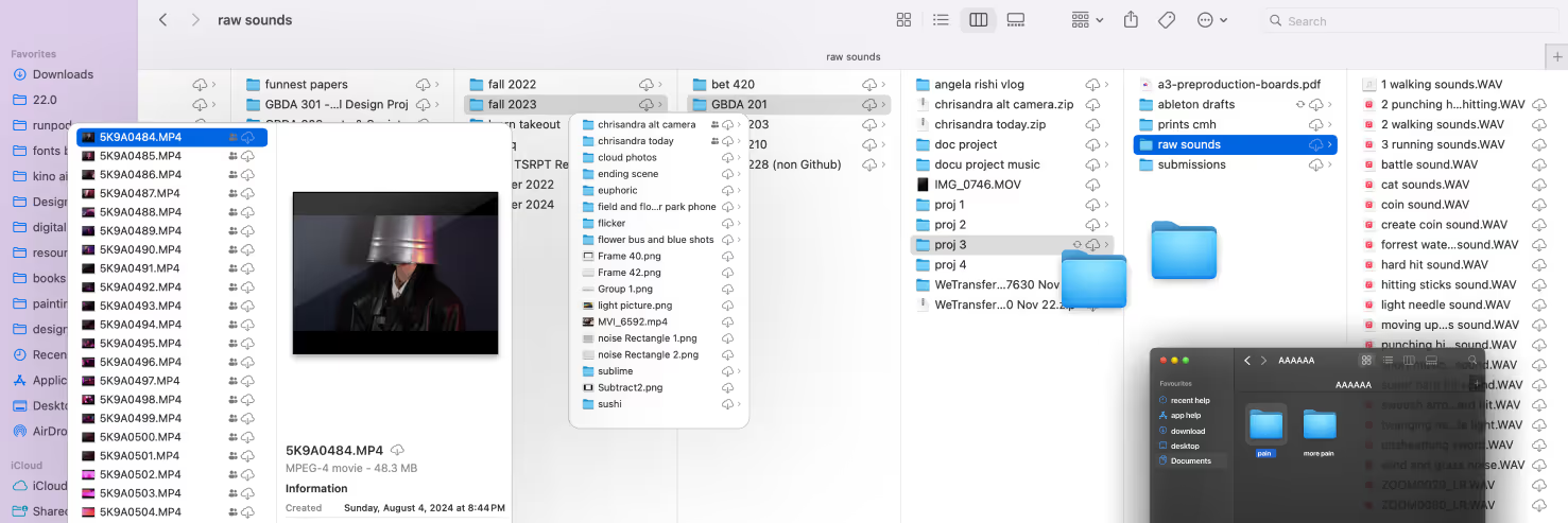
Design that feels modern & Intuitive
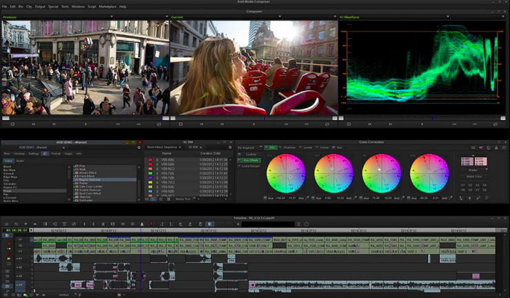
Before Kino, editors had no easy way to visualize their files. They relied on complex, legacy tools like Excel spreadsheets and Avid; often overwhelming.
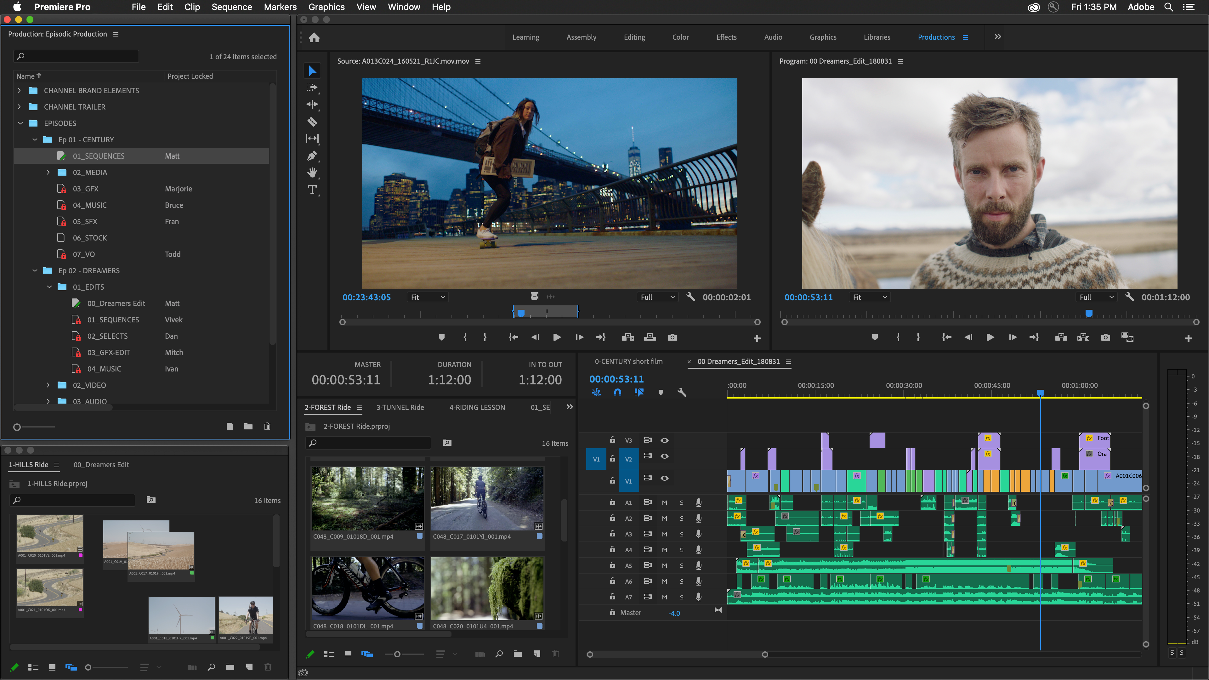
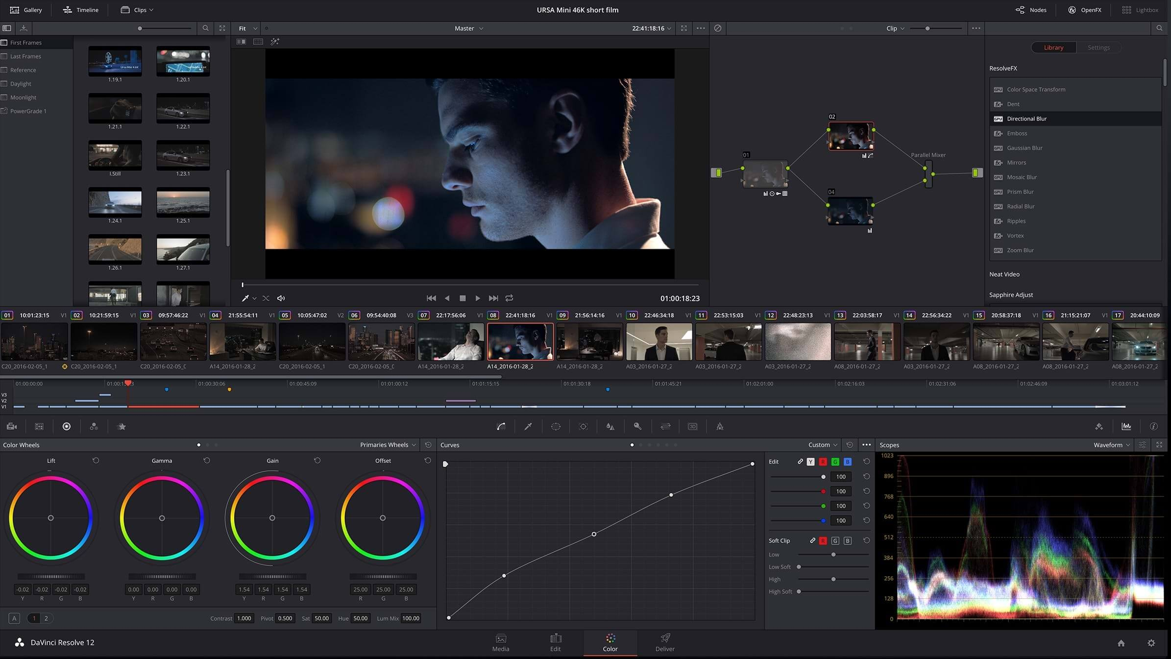
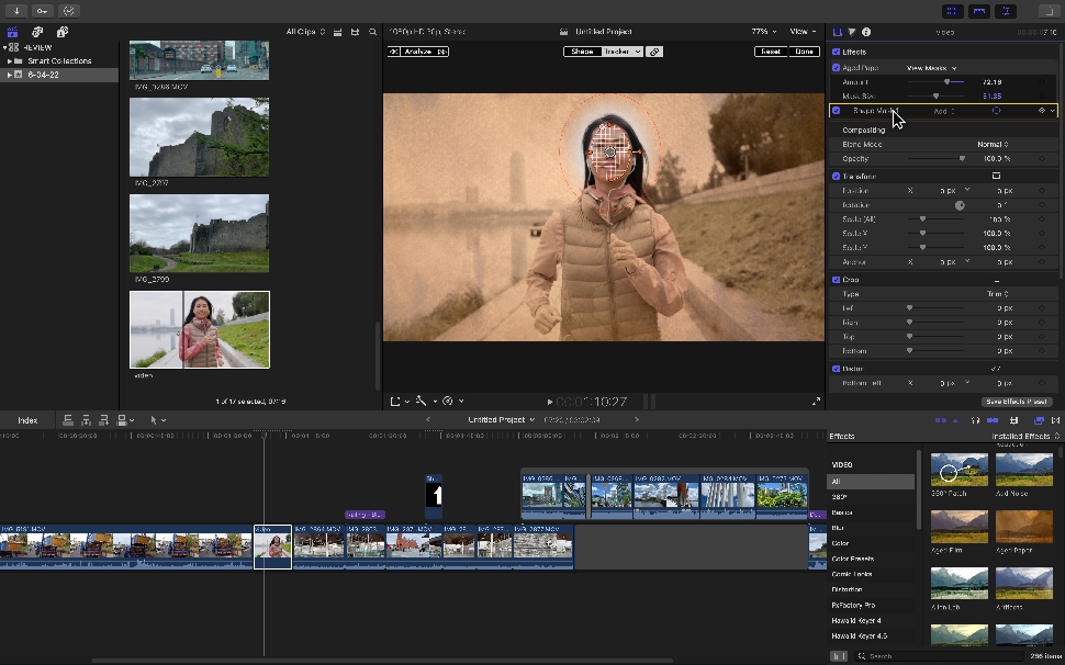
Our design borrows familiar patterns from the apps editors use daily, creating an interface that feels modern, assistive, responsive, and collaborative.
Avid
Premiere Pro
Davinci Resolve
Final Cut Pro
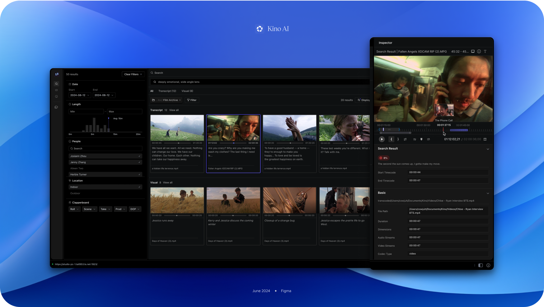
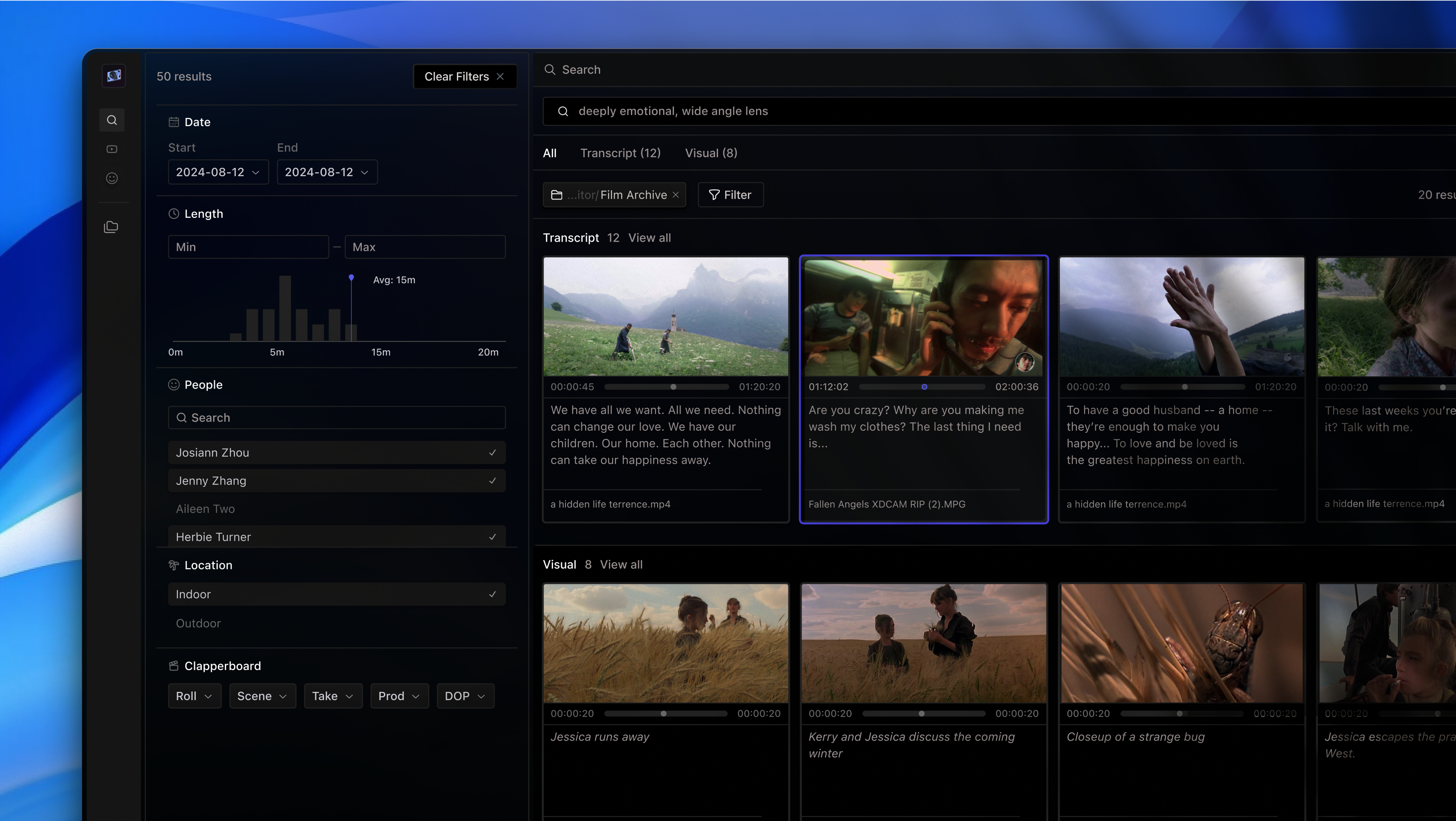
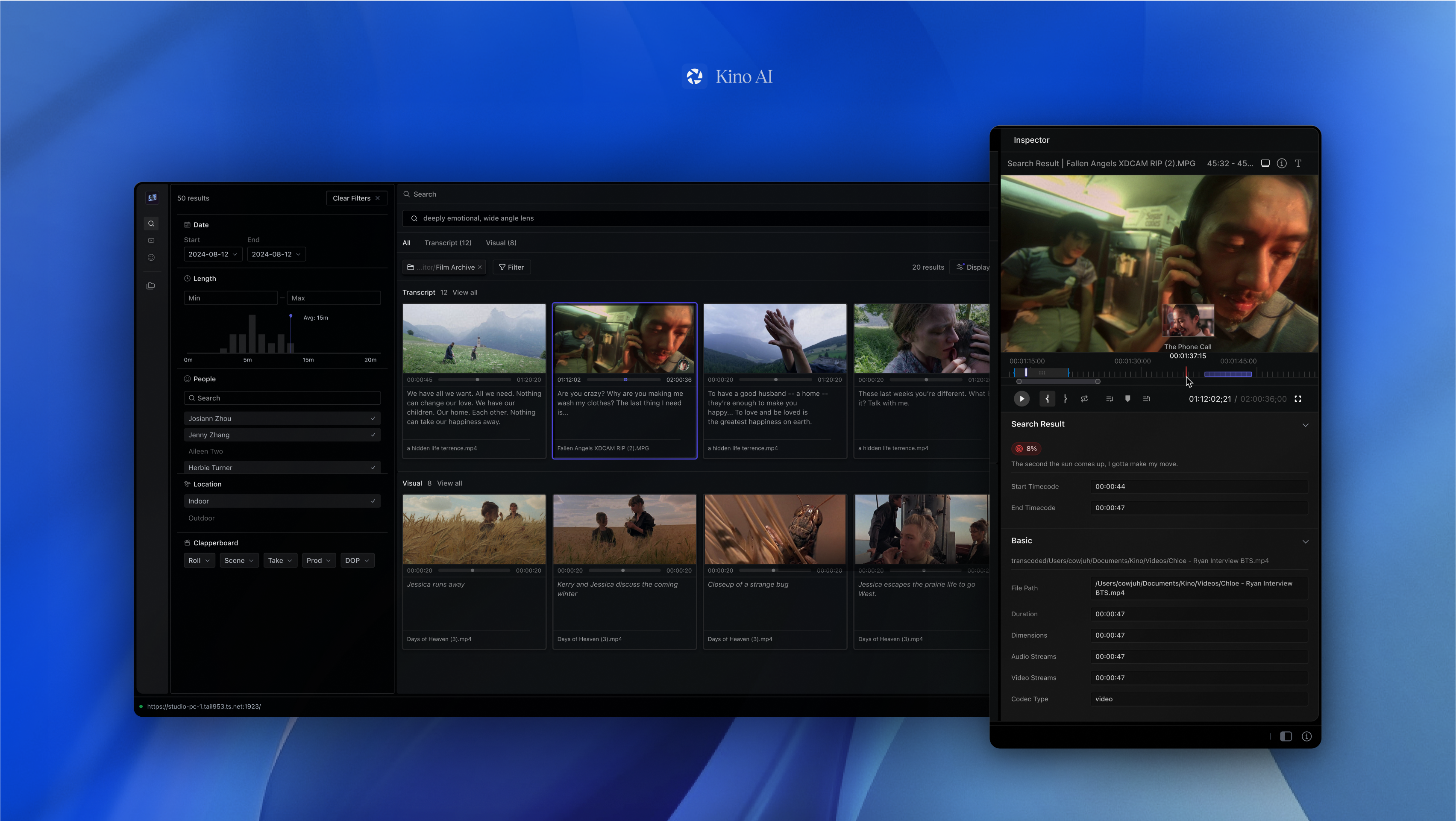
Instead of returning isolated clips, search now surfaces quote-rich results — allowing editors to visually skim for meaning, not just match.
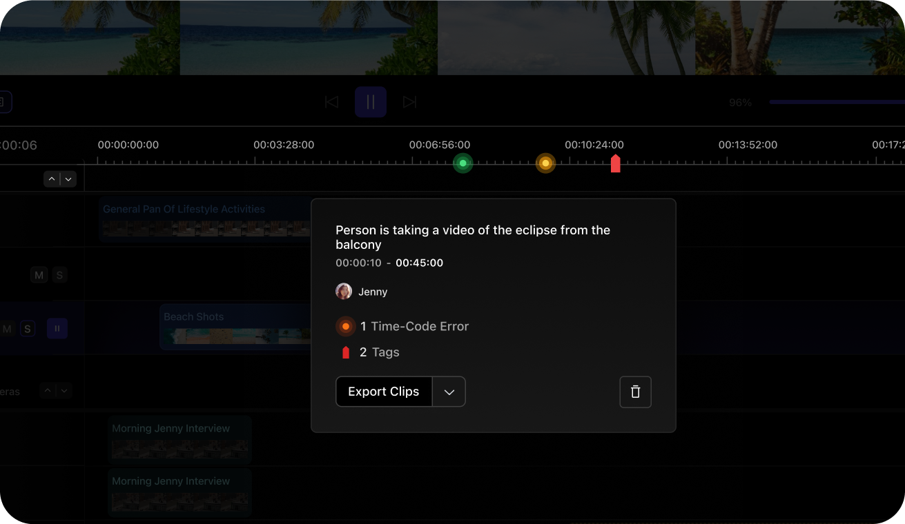
Jenny, Luke, & I reimagined the metadata inspector as a high-density panel, packing in speaker tags, timestamps, locations, and script references to help users reorient instantly within sprawling footage: instead of returning isolated clips.
Traditional file previews can’t keep up with editors.
Kino is awesome for intent-based searching. But what if you only vaguely know what you want?
My challenge was to bridge the gap between their mental models and our media libraries. In layman’s terms, I wanted to unify how editors organize stories in their minds, and how footage is organized in software.
It’s hard to navigate footage when your tools don’t reflect how you think.
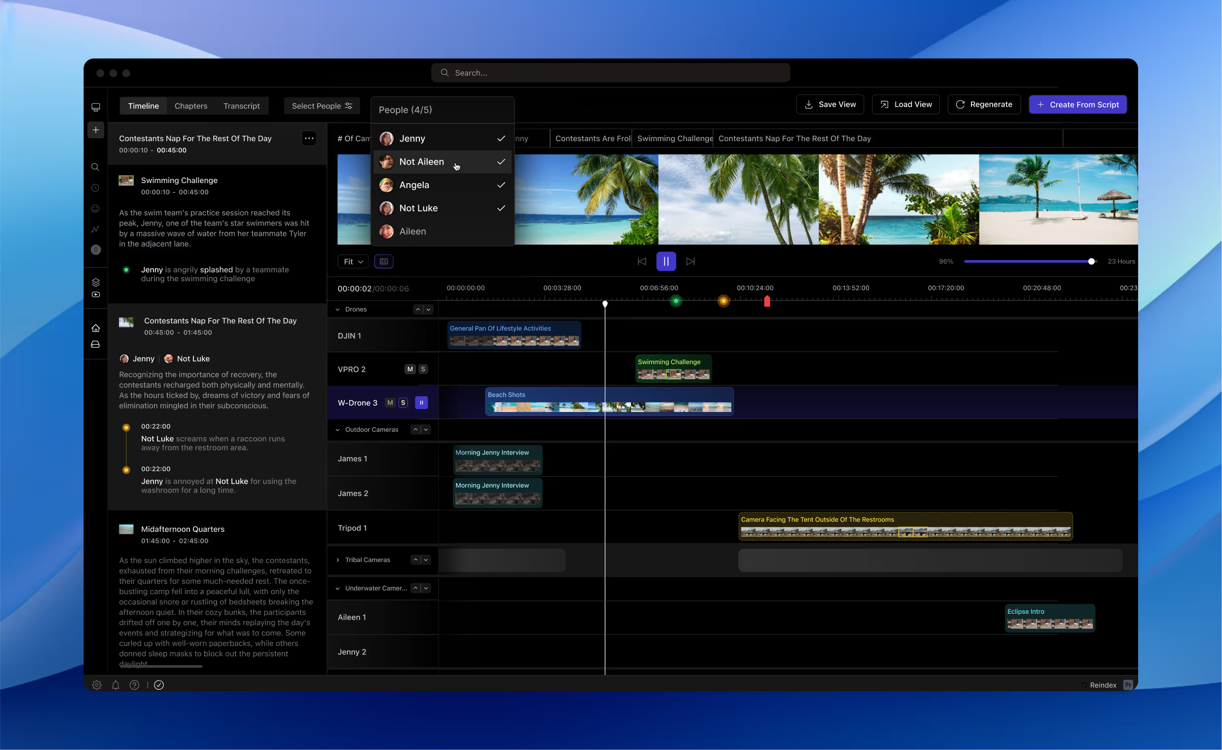
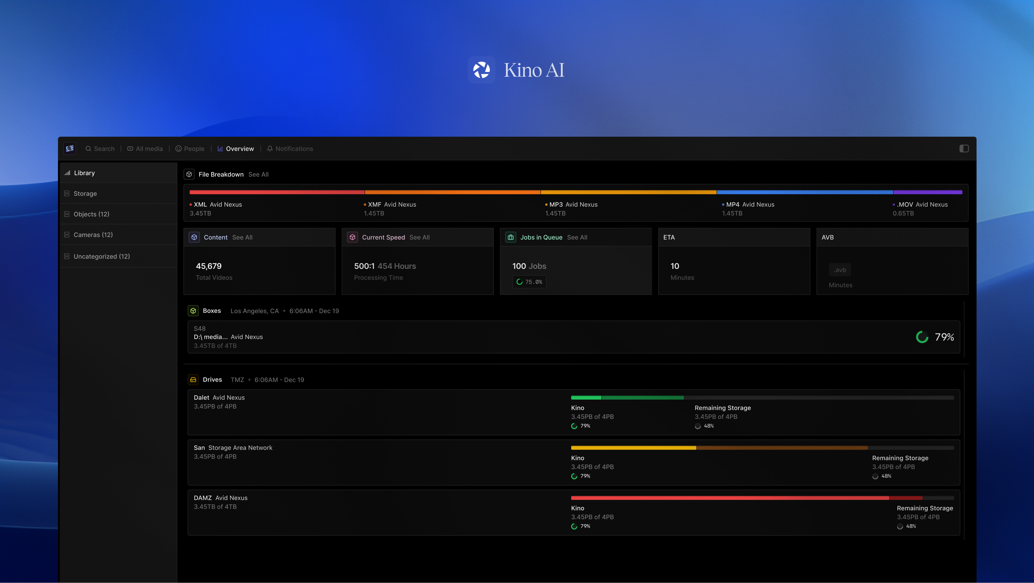
Unlocking the technical ability to organize all footage by timecode, we saw a new opportunity to recreate the classic timeline metaphor, in our video gallery.
Every editor sits on mountains of footage [think terrabytes], but they scrub through clips one-by-one for hours.
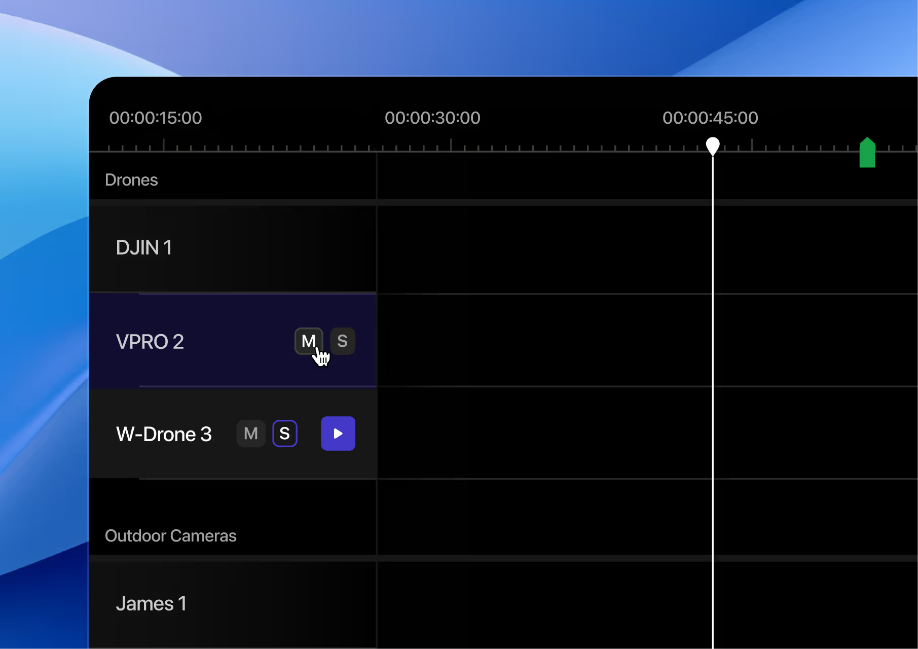
Zoom through multiple camera feeds (some editors deal with 100+ cameras). Collapse, preview, & re-organize simplified camera groups
I leveraged leverage familiar video-editing patterns like ribbons, timeline indicators, and tracks to reduce the learning curve and cognitive load for editors: some editors deal with 100+ cameras!
Our goal is not to reinvent the wheel for the sake of reinventing it — it's to meet our users where they are before introducing something new.
Rather than mapping cameras onto chapters (a common pattern), I fixed cameras as persistent, reorderable rows on the left — aligning them with a continuous film ribbon that stretched across time.
In my re-imagining of Kino’s interface, we targeted metrics like:
- Time saved in post-production
- Cost reduction per episode
- Customer Retention
- Time to [aha moment]
Jenny Zhang

Aileen

Lucas Igel
Amanda
The End
Over the term, I gained a clearer understanding of sales cycles, friction in client onboarding, and the subtleties of getting buy-in during software approval processes.
Designing for Kino was designing for villages of people: hundreds of cameras, months of footage, years of scripts. While I initially joined Kino to improve their creative tooling for filmmakers, I quickly realized the deeper challenge lay elsewhere: in aligning complex software with the messy, and sometimes rigid human workflows of enterprise movie production.
Learnings
Living inside of existing systems
Instead of overhauling workflows, we designed within existing systems: respecting what’s familiar helped us introduce change with less friction.
Swim in a blue ocean, not a red one
Most tools fight to own the edit — we focus on the messy pre-edit phase instead. By improving this underbuilt space (tagging, tracking, and surfacing raw footage), we started swimming in a blue ocean— creating a new value layer above editing software itself and differentiating without clashing against incumbents like Premiere or Resolve.
Movies aren’t made overnight, & software isn’t either
At Kino, I learned to embrace design constraints with care. Designing for Kino meant thinking at scale, & pushing for clarity. I learned to scope tightly, define clear personas, and prioritize ruthlessly.
Thank yous
This is just the beginning for Kino. I’m grateful to Luke, Jenny, Angela, and Ashley for giving me the trust, mentorship, and noodles to make my work possible.

find my design interesting?
Let’s ship to the next billion ;)
Email me

curius
resume.pdf

Back to Home
Design Intern
Fall 2024, 14 weeks
Re-imagining File Management for Filmmakers
Filmmakers are drowning in footage long before they start editing.
I designed a new way for editors to browse, summarize, and organize video, before editing begins.
At Kino AI, I led design efforts like branding, the redesign of Search, and, Timeline: a multi-camera, AI-powered interface that helps editors find meaning amidst terabytes of footage.
Backed by
Movies are humanity’s stories, hopes, & dreams.
One of the hardest truths in post-production is that much of the process isn’t very beautiful: finding clips is painful, slow, and tedious.
At Kino, we asked ourselves: How can we make more parts of the editing process feel lighter, faster, and more human?
[UXR] One assistant reality TV editor told us they spent ~70% of their time just finding footage. That kind of inefficiency isn’t just frustrating — it’s expensive.

Up until the point editors are opening their video-editing apps, there’s a loss of knowledge
Dealing with my own tangled folder structures and chaotic clip names, I took my empathy and stepped into a much larger stage: 100+ cameras, 24/7 logging, and enterprise clients with million-dollar sets.
Up until the point editors are opening their video-editing apps, there’s a loss of knowledge-- no easy way to visualize your files. While Kino already offered AI tagging and search, it often surfaced content out of narrative context. Editors were still relying on Post-its, chat logs, and personal spreadsheets to keep track of important moments.
In the best software that money can buy, footage was searchable, but still contextless.

pain
my files system for a 5 min documentary!

Design that feels modern & Intuitive
Before Kino, editors had no easy way to visualize their files. They relied on complex, legacy tools like Excel spreadsheets and Avid; often overwhelming.
Our design borrows familiar patterns from the apps editors use daily, creating an interface that feels modern, assistive, responsive, and collaborative.
Avid

Premiere Pro

Davinci Resolve

Final Cut Pro

Instead of returning isolated clips, search now surfaces quote-rich results — allowing editors to visually skim for meaning, not just match.
Jenny, Luke, & I reimagined the metadata inspector as a high-density panel, packing in speaker tags, timestamps, locations, and script references to help users reorient instantly within sprawling footage: instead of returning isolated clips.

Traditional file previews can’t keep up with editors.
Kino is awesome for intent-based searching. But what if you only vaguely know what you want?
My challenge was to bridge the gap between their mental models and our media libraries. In layman’s terms, I wanted to unify how editors organize stories in their minds, and how footage is organized in software.
It’s hard to navigate footage when your tools don’t reflect how you think.
Unlocking the technical ability to organize all footage by timecode, we saw a new opportunity to recreate the classic timeline metaphor, in our video gallery.
Every editor sits on mountains of footage [think terrabytes], but they scrub through clips one-by-one for hours.
Zoom through multiple camera feeds (some editors deal with 100+ cameras). Collapse, preview, & re-organize simplified camera groups
I leveraged leverage familiar video-editing patterns like ribbons, timeline indicators, and tracks to reduce the learning curve and cognitive load for editors: some editors deal with 100+ cameras!
Our goal is not to reinvent the wheel for the sake of reinventing it — it's to meet our users where they are before introducing something new.
Rather than mapping cameras onto chapters (a common pattern), I fixed cameras as persistent, reorderable rows on the left — aligning them with a continuous film ribbon that stretched across time.
In my re-imagining of Kino’s interface, we targeted metrics like:
- Time saved in post-production
- Cost reduction per episode
- Customer Retention
- Time to [aha moment]


Jenny Zhang

Aileen

Lucas Igel
Amanda

The End
Over the term, I gained a clearer understanding of sales cycles, friction in client onboarding, and the subtleties of getting buy-in during software approval processes.
Designing for Kino was designing for villages of people: hundreds of cameras, months of footage, years of scripts. While I initially joined Kino to improve their creative tooling for filmmakers, I quickly realized the deeper challenge lay elsewhere: in aligning complex software with the messy, and sometimes rigid human workflows of enterprise movie production.
Learnings
Living inside of existing systems
Instead of overhauling workflows, we designed within existing systems: respecting what’s familiar helped us introduce change with less friction.
Swim in a blue ocean, not a red one
Most tools fight to own the edit — we focus on the messy pre-edit phase instead. By improving this underbuilt space (tagging, tracking, and surfacing raw footage), we started swimming in a blue ocean— creating a new value layer above editing software itself and differentiating without clashing against incumbents like Premiere or Resolve.
Movies aren’t made overnight, & software isn’t either
At Kino, I learned to embrace design constraints with care. Designing for Kino meant thinking at scale, & pushing for clarity. I learned to scope tightly, define clear personas, and prioritize ruthlessly.
Thank yous
This is just the beginning for Kino. I’m grateful to Luke, Jenny, Angela, and Ashley for giving me the trust, mentorship, and noodles to make my work possible.

find my design interesting?
Let’s ship to the next billion ;)
Email me

curius
resume.pdf

Back to Home
Design Intern
Fall 2024, 14 weeks
Re-imagining File Management for Filmmakers
Filmmakers are drowning in footage long before they start editing.
I designed a new way for editors to browse, summarize, and organize video, before editing begins.
At Kino AI, I led design efforts like branding, the redesign of Search, and, Timeline: a multi-camera, AI-powered interface that helps editors find meaning amidst terabytes of footage.
Backed by
Movies are humanity’s stories, hopes, & dreams.
One of the hardest truths in post-production is that much of the process isn’t very beautiful: finding clips is painful, slow, and tedious.
At Kino, we asked ourselves: How can we make more parts of the editing process feel lighter, faster, and more human?
[UXR] One assistant reality TV editor told us they spent ~70% of their time just finding footage. Inefficiency is frustrating & expensive!

Up until the point editors are opening their video-editing apps, there’s a loss of knowledge
While Kino already offered AI tagging and search, it often surfaced content out of narrative context. Editors were still relying on Post-its, chat logs, and personal spreadsheets to keep track of important moments.
In the best software that money can buy, footage was searchable, but still contextless.

pain
my files system for a 5 min documentary!

Design that feels modern & intuitive
Before Kino, editors had no easy way to visualize their files. They relied on complex, legacy tools like Excel spreadsheets and Avid; often overwhelming.
Our design borrows familiar patterns from the apps editors use daily, creating an interface that feels modern, assistive, responsive, and collaborative.
Avid

Premiere Pro

Davinci Resolve

Final Cut Pro

Search now surfaces quote-rich results — allowing editors to visually skim for meaning, not just match.
Jenny, Luke, & I reimagined the metadata inspector as a high-density panel, packing in speaker tags, timestamps, locations, and script references to help users reorient instantly within sprawling footage: instead of returning isolated clips.

Traditional file previews can’t keep up with editors.
My challenge was to bridge the gap between their mental models and our media libraries. In layman’s terms, I wanted to unify how editors organize stories in their minds, and how footage is organized in software.
It’s hard to navigate footage when your tools don’t reflect how you think.
Unlocking the technical ability to organize all footage by timecode, we saw a new opportunity to recreate the classic timeline metaphor, in our video gallery.
Every editor sits on mountains of footage [think terrabytes], but they scrub through clips one-by-one for hours.
Zoom through multiple camera feeds.
Collapse, preview, & re-organize simplified camera groups
I leveraged leverage familiar video-editing patterns like ribbons, timeline indicators, and tracks to reduce the learning curve and cognitive load for editors: some editors deal with 100+ cameras!
Rather than mapping cameras onto chapters (a common pattern), I fixed cameras as persistent, reorderable rows on the left — aligning them with a continuous film ribbon that stretched across time.


Jenny Zhang

Aileen

Lucas Igel
Amanda

The End
Over the term, I gained a clearer understanding of sales cycles, friction in client onboarding, and the subtleties of getting buy-in during software approval processes.
Designing for Kino was designing for villages of people: hundreds of cameras, months of footage, years of scripts. While I initially joined Kino to improve their creative tooling for filmmakers, I quickly realized the deeper challenge lay elsewhere: in aligning complex software with the messy, and sometimes rigid human workflows of enterprise movie production.
My Learnings
Living inside of existing systems
Instead of overhauling workflows, we designed within existing systems: respecting what’s familiar helped us introduce change with less friction.
Swim in a blue ocean, not a red one
Most tools fight to own the edit — we focus on the messy pre-edit phase instead. By improving this underbuilt space (tagging, tracking, and surfacing raw footage), we started swimming in a blue ocean— creating a new value layer above editing software itself and differentiating without clashing against incumbents like Premiere or Resolve.
Movies aren’t made overnight, & software isn’t either
At Kino, I learned to embrace design constraints with care. Designing for Kino meant thinking at scale, & pushing for clarity. I learned to scope tightly, define clear personas, and prioritize ruthlessly.
Thank yous
This is just the beginning for Kino. I’m grateful to Luke, Jenny, Angela, and Ashley for giving me the trust, mentorship, and noodles to make my work possible.

find my design interesting?
Let’s ship to the next billion ;)
Email me
